Building a versatile design system for IDFC
Client — IDFC FIRST Bank
Research, Strategy, User Experience
2022— Present
The IDFC design system is a comprehensive design system that guides the creation of products, services, and digital experiences for IDFC. As we were building the various journeys, we began putting together a visual language that could be expanded, scaled and create a cohesion between all the various teams bringing this product to life
Developing a design language that is unique to tell the IDFC story
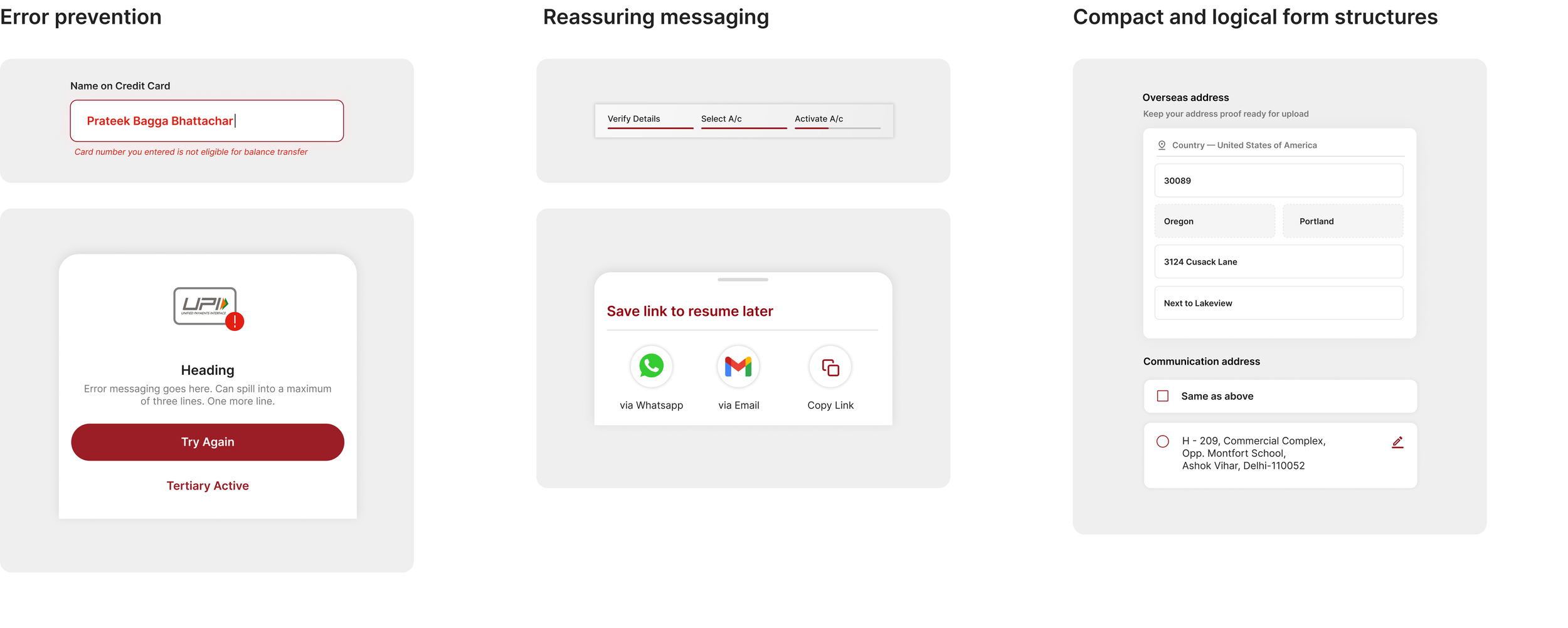
We realised that building a design system for a traditional bank embracing newer technology would pose its own set of challenges.
We researched a lot of existing design systems within the fintech space and beyond. We drew our inspiration from adobe spectrum, spotify and lyft. We felt that systems that prioritised multi platform design would be helpful to build our own.
As we undertook this exercise embraced the following —
01 —
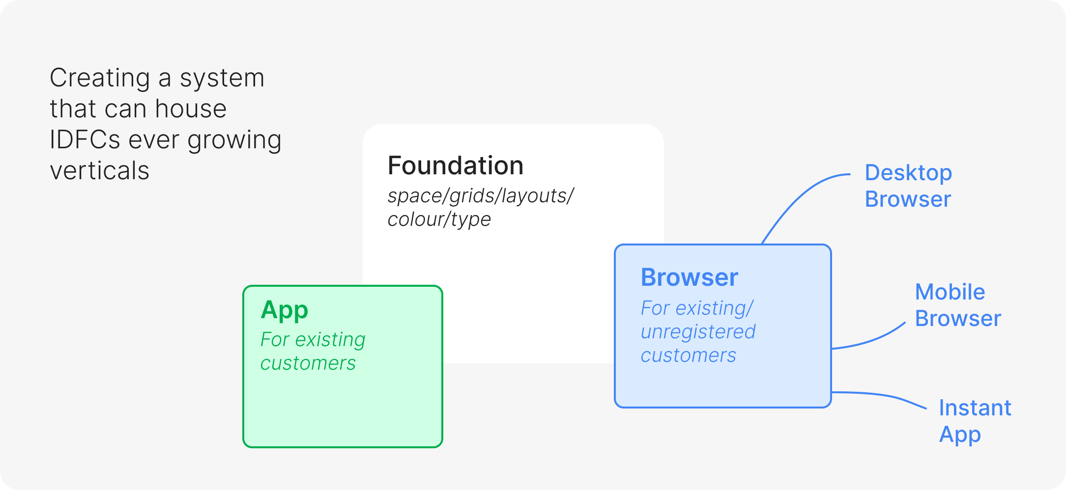
Putting the users at the forefront we wanted to accomodate for IDFC and its various verticals to fit into one framework yet be its own system. The design system encompasses mobile experiences, desktop experiences as well as experiences for new-to-bank and existing-to-bank customers that are all connected under the same umbrella
Connecting the verticals
02 —
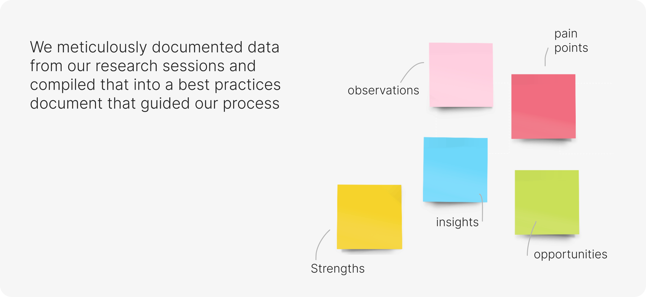
We wanted to document things beyond type, colour, component sizes and highlight some of the learnings and research along the way that shaped the experience of the products and reduces back and forth.
Documenting decision making
03 —
Design systems are not one size fits all and its hard to truly template-ize financial interfaces and experiences, each journey presents different set of challenges. Rather than create rigid rules we wanted to create an ecosystem of evolving components.
An evolving ecosystem
04 —
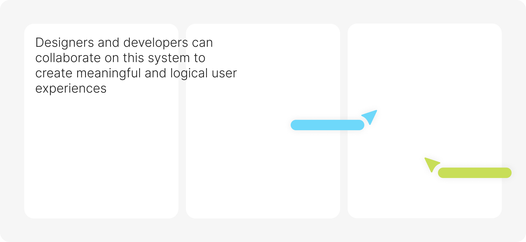
The design system is aimed to guide and bring together multiple stakeholders beyond just designers and engineers with room for growth as the product grows.
Collaboration and scalability

We approached this in a way that would make most sense for an organisation with parallel functioning variables that arise from both, IDFC as an organisation and fintech as an industry
Setting up the foundation
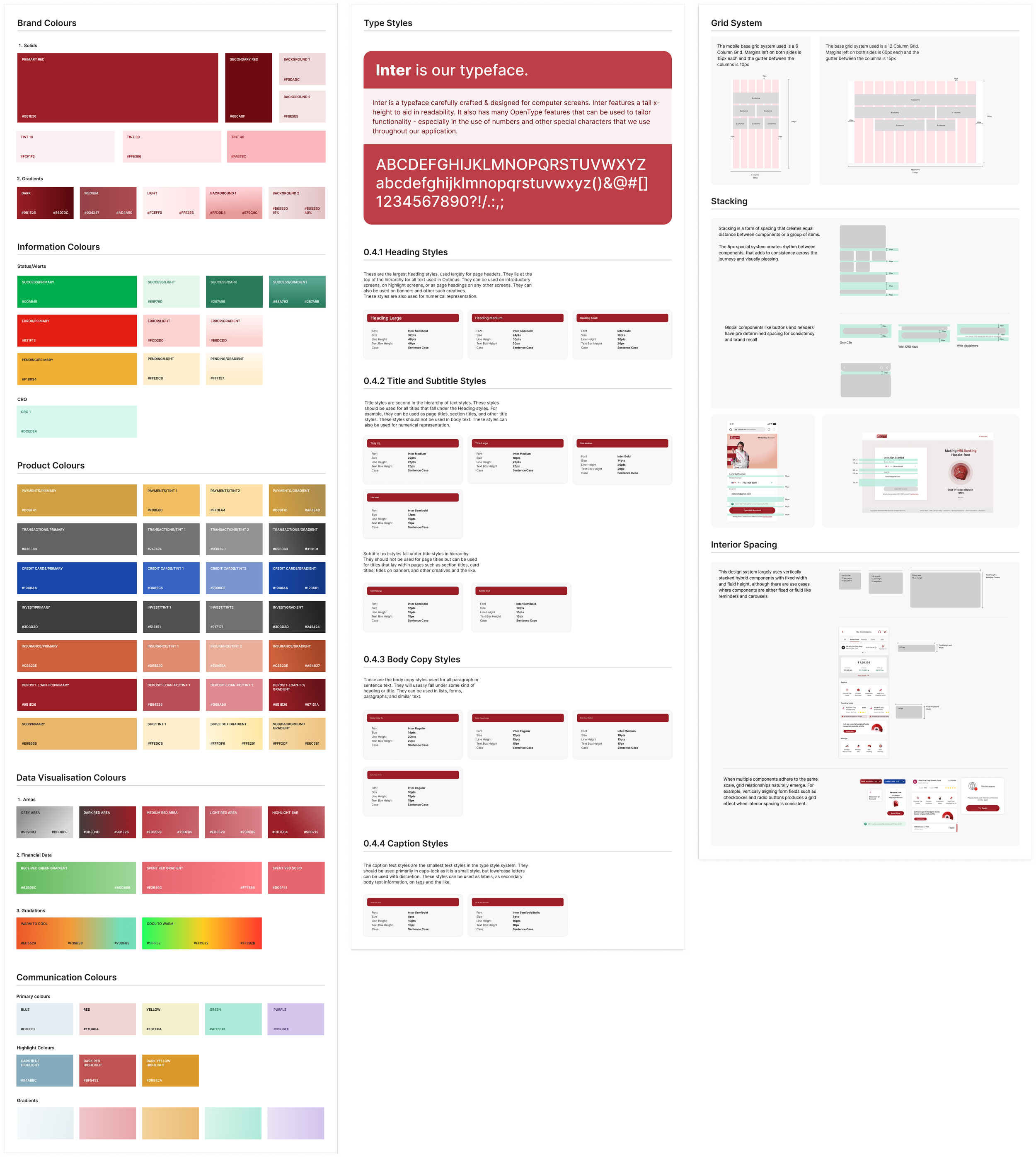
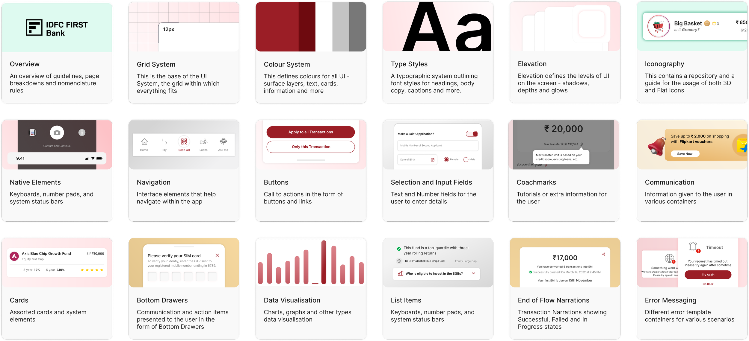
We laid down our foundational elements like, typography, colour system, grids, spacing, iconography, into a style guide.
This gave us direction on how to proceed with establishing hierarchies and come up with design solutions for our verticals —
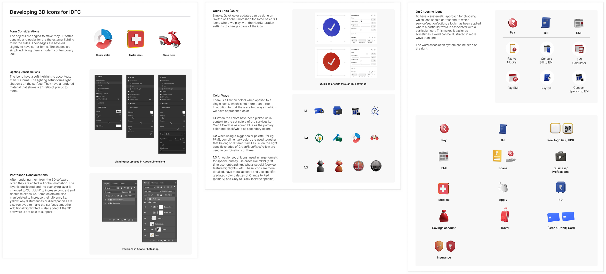
Developing an icon system
Each Icon style adds to the overall cohesiveness of the screens adding moments of functionality and visual harmony —
Iconography and visual cues are quite important for a financial app that caters to a wide audience. We quickly realised that we would need multiple styles of icons to function in tandem to communicate seamlessly, however our visual language that extends into other touchpoints for IDFC is build around the 3D icons —
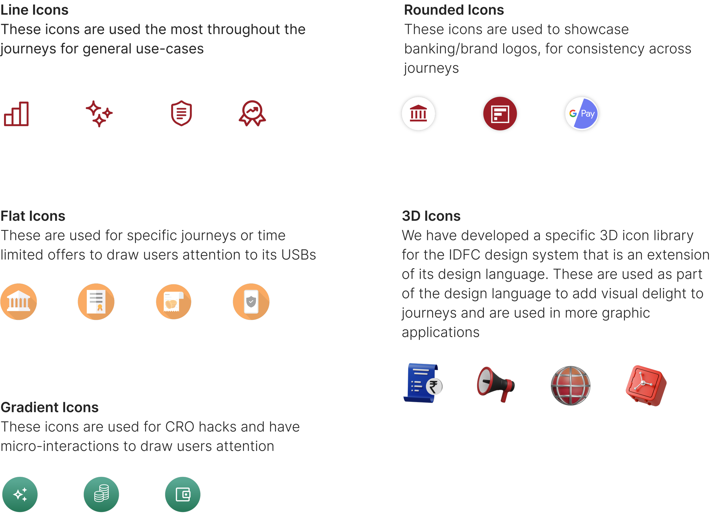
The 3D icons form the crux of the digital experience for the IDFC user tying in all the visual elements together to form a unique yet identifiable design language. We created a repository of icons that are used in various permutations and combinations throughout the journeys —
Compiling the System Library
Keeping it small
Rather than template-ising screens, we spent a significant amount of time on defining and naming our atomic tokens that can be used in larger compositions and in as many variations. We wanted to be intentional with keeping the units small and not define larger units
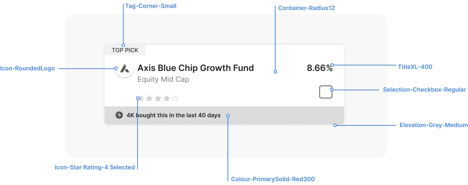
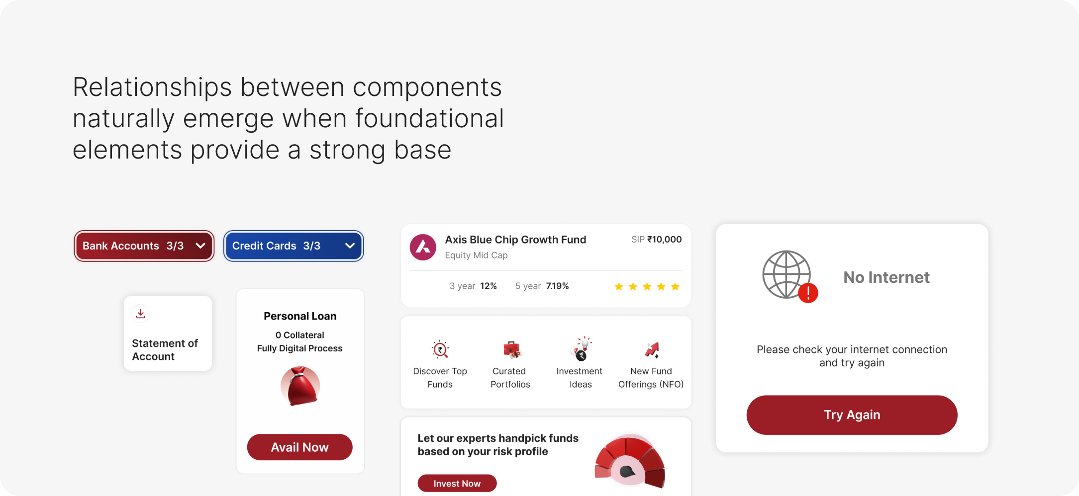
Defining smaller atoms helped us prioritze the individual demands of a journey while still maintaining cohesiveness
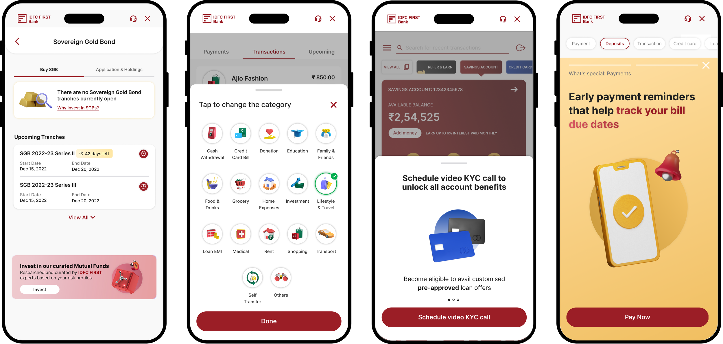
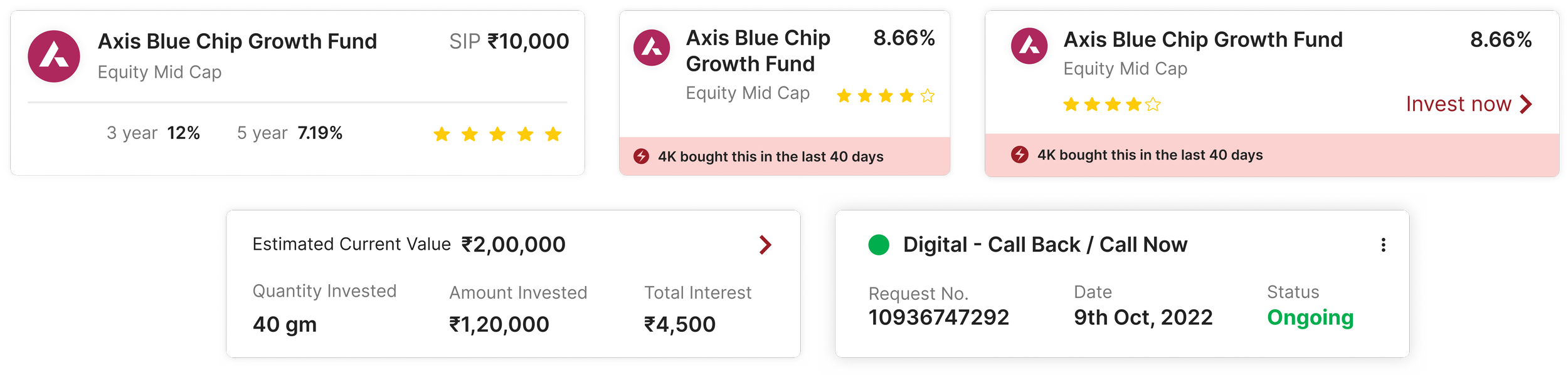
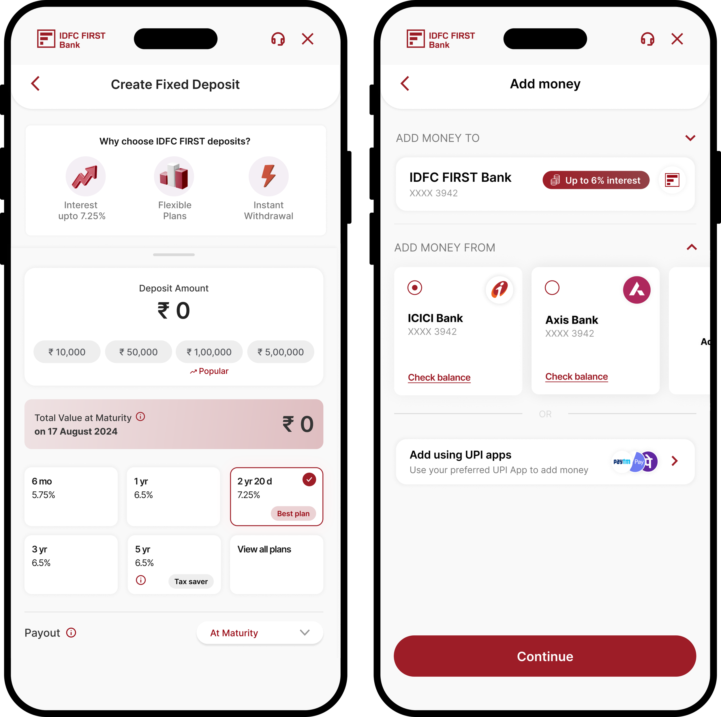
Transaction based journeys prioritise transparency, progressive disclosure and concise hierarchy of steps —
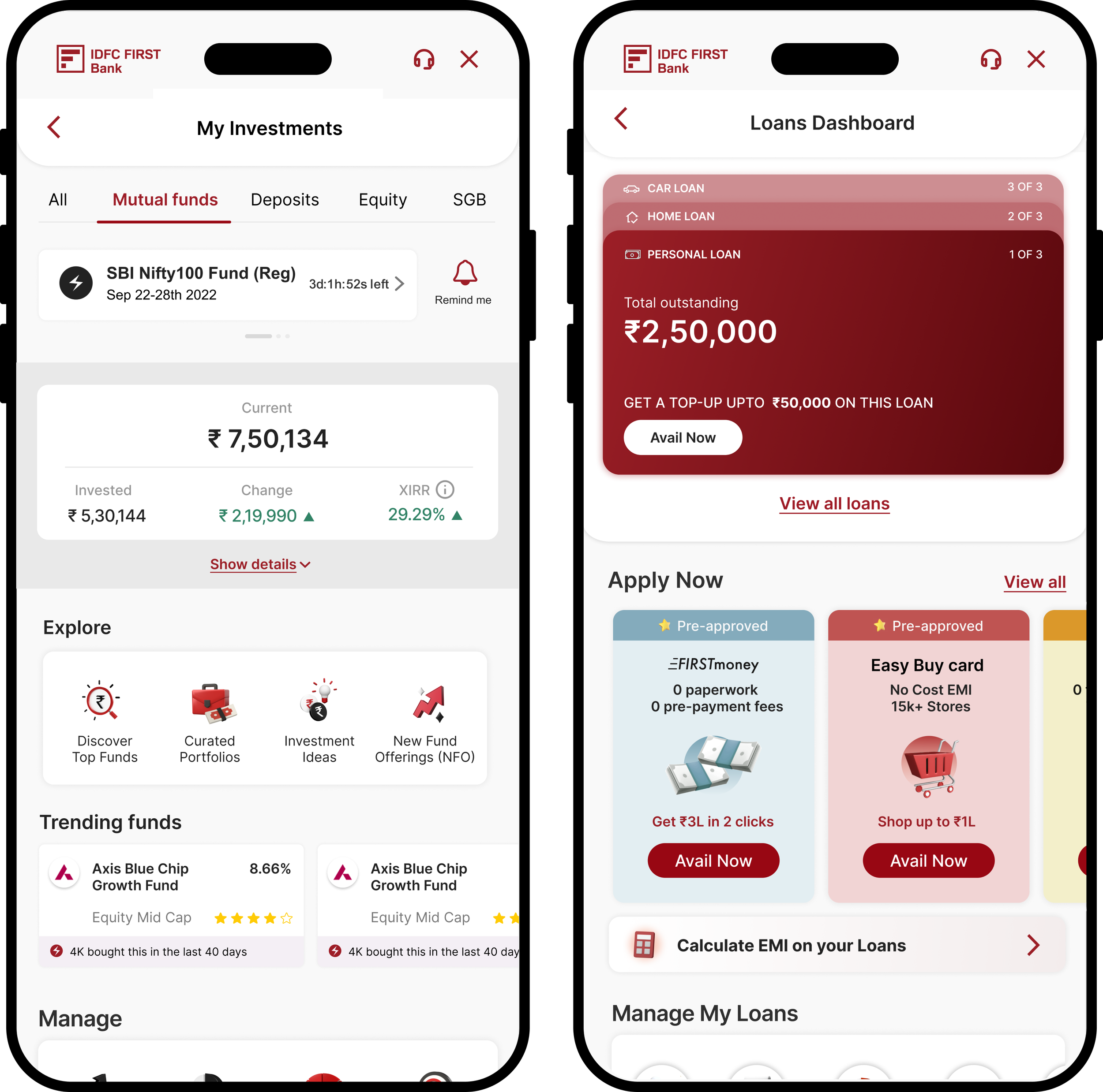
Investment based journeys are structured like mini dashboards with personal stats and space for exploration —
Platform and scale considerations
Based on our research, most of our tier 2/tier 3 city users use android phones and tier one cities use iPhones, and while there are a lot of design systems that use a singular repository we figured that designing for specificites would yield a better results for our varied users.
Spacing, alignment, navigation and input and selection fields were some of the places we took this into heavy consideration.
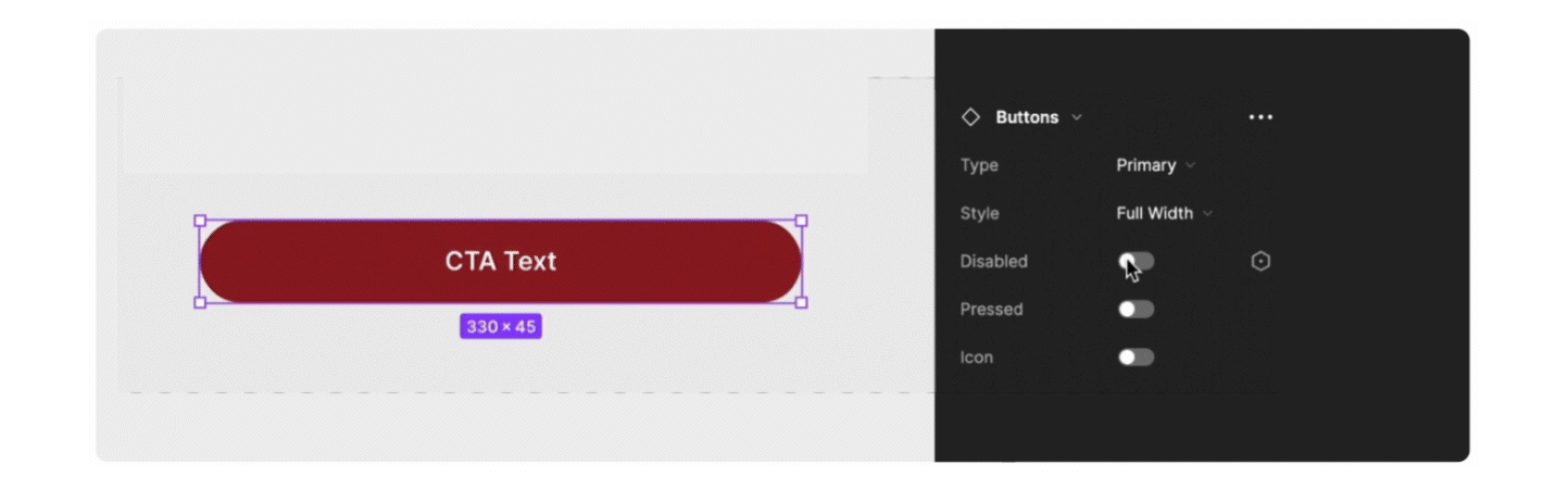
We chose to build the system in figma, which lent itself well to building screens for designers as well as dev mode for engineers.
Component settings and prototype settings allowed us to churn out screens and test them and interactions at a faster pace.
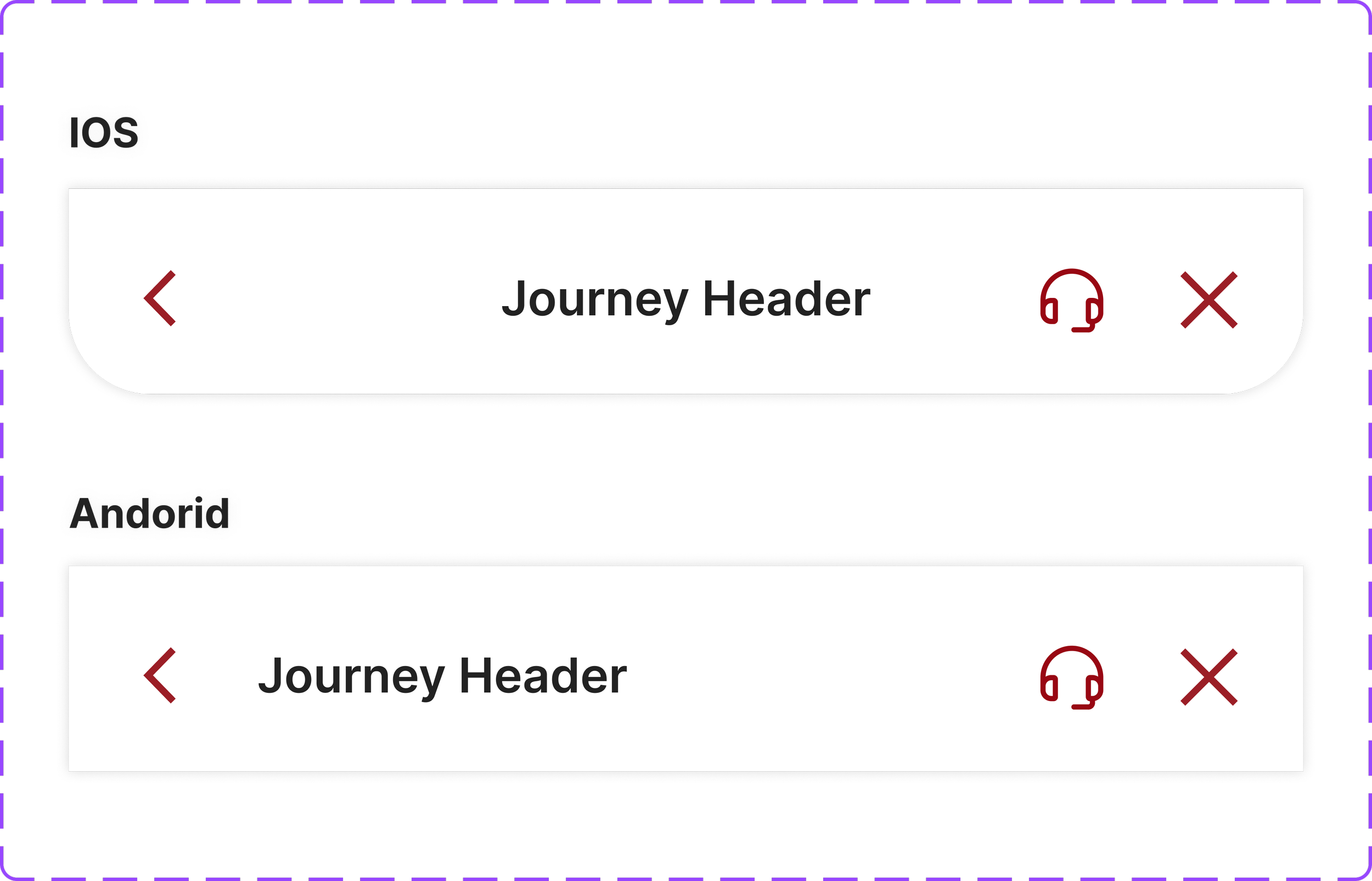
The button component, for example, highlights how we sought about for cohesion — defining hierarchies, size frameworks and naming conventions.
Prioritising inclusivity