IDFC's Digital Evolution –
A Case Study
Client — IDFC FIRST Bank
Research, Strategy, User Experience
2022— Present
With its foray into new-age banking, the team at Nowform collaborated with the team at IDFC to transform their digital touchpoints across platforms and ecosystems and cement them as a solid competitor in the fintech market.
The team at IDFC were eager to take a step further than just traditional banking services and lead this new revamp with a more tech-empowered approach.
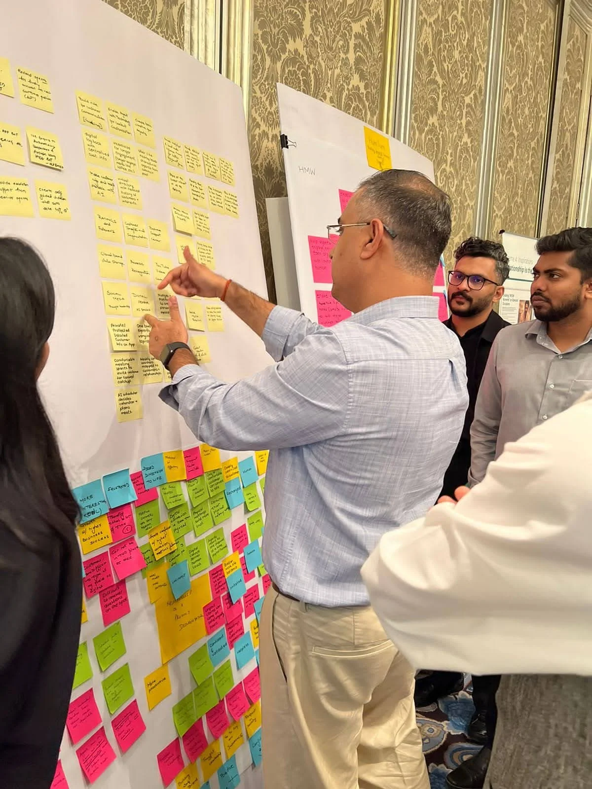
We started by conducting primary research to align user and business needs, conducted sprints to test out ideas and build a roadmap, built easy-to-use interfaces and journeys, solidified user experience with extensive user testing, and created a robust and accommodative design system
Key Journeys
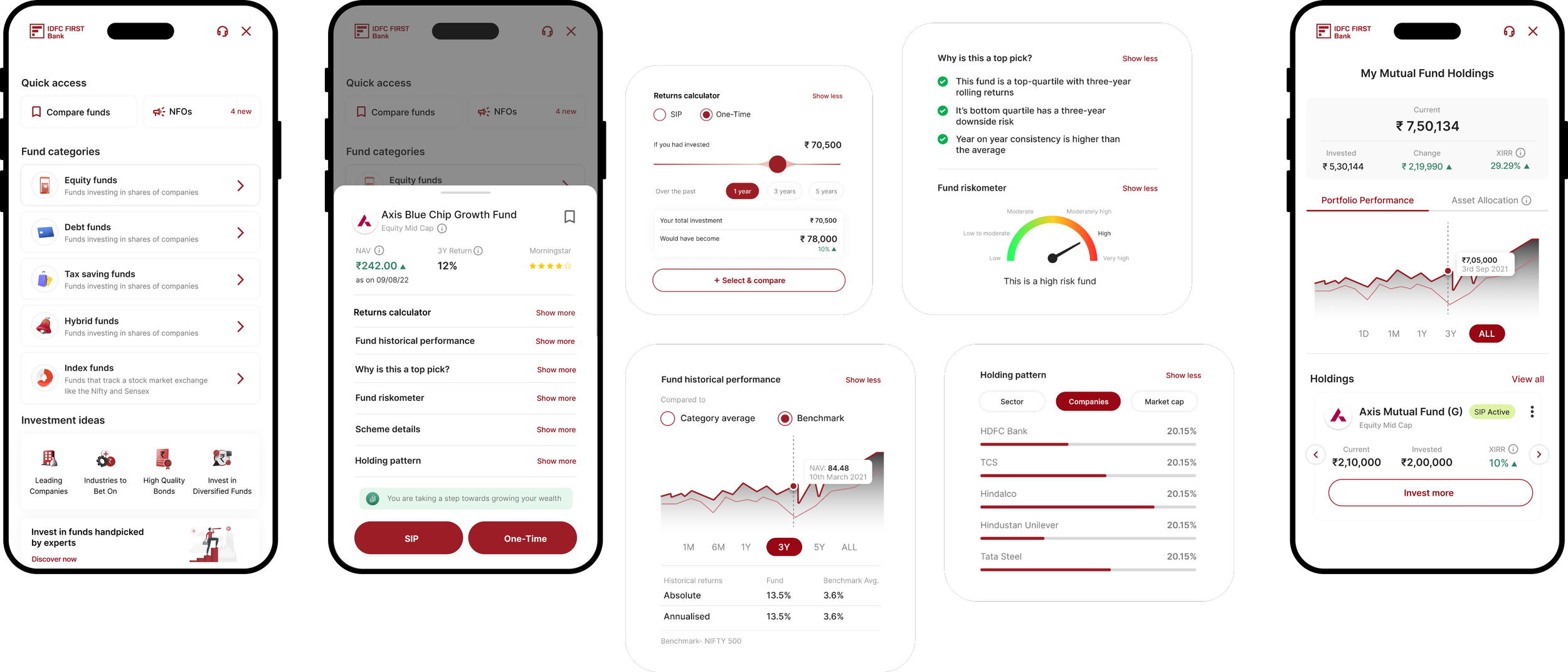
We rebuilt the information architecture of the dashboard and prioritise 14 main journeys with a mobile-first approach and responsive layouts for both new to bank and existing customers —
Key Interventions
01 —
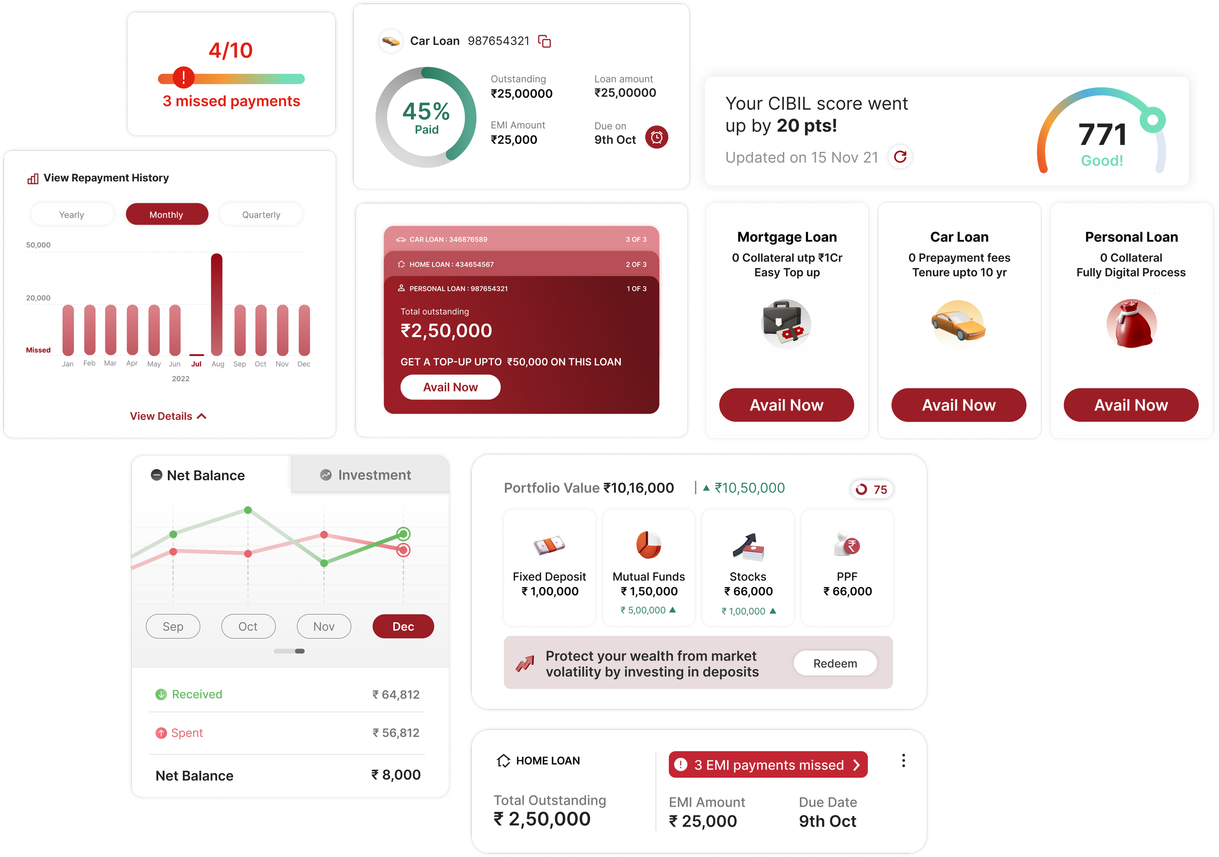
Building data rich dashboards for journeys like Loans and Money Manager
02 —
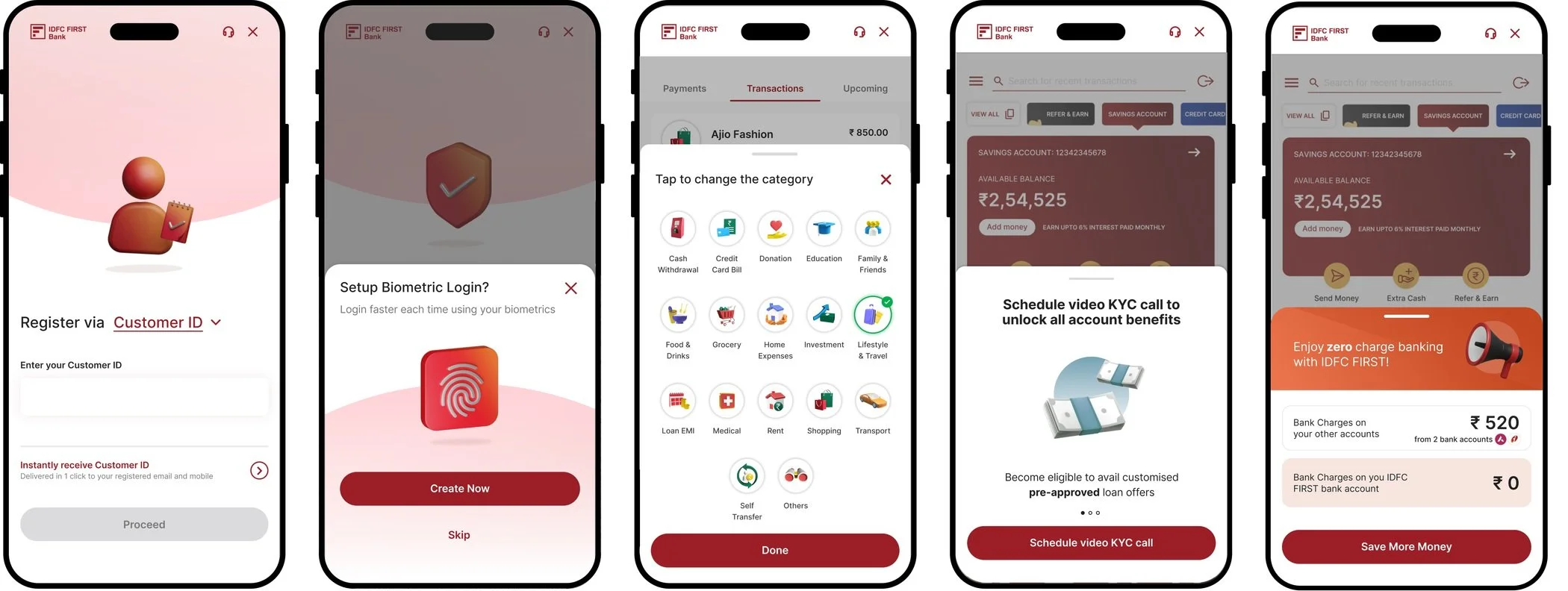
Creating a storytelling and narrative with custom icons for Onboarding and Personal Finance Manager
03 —
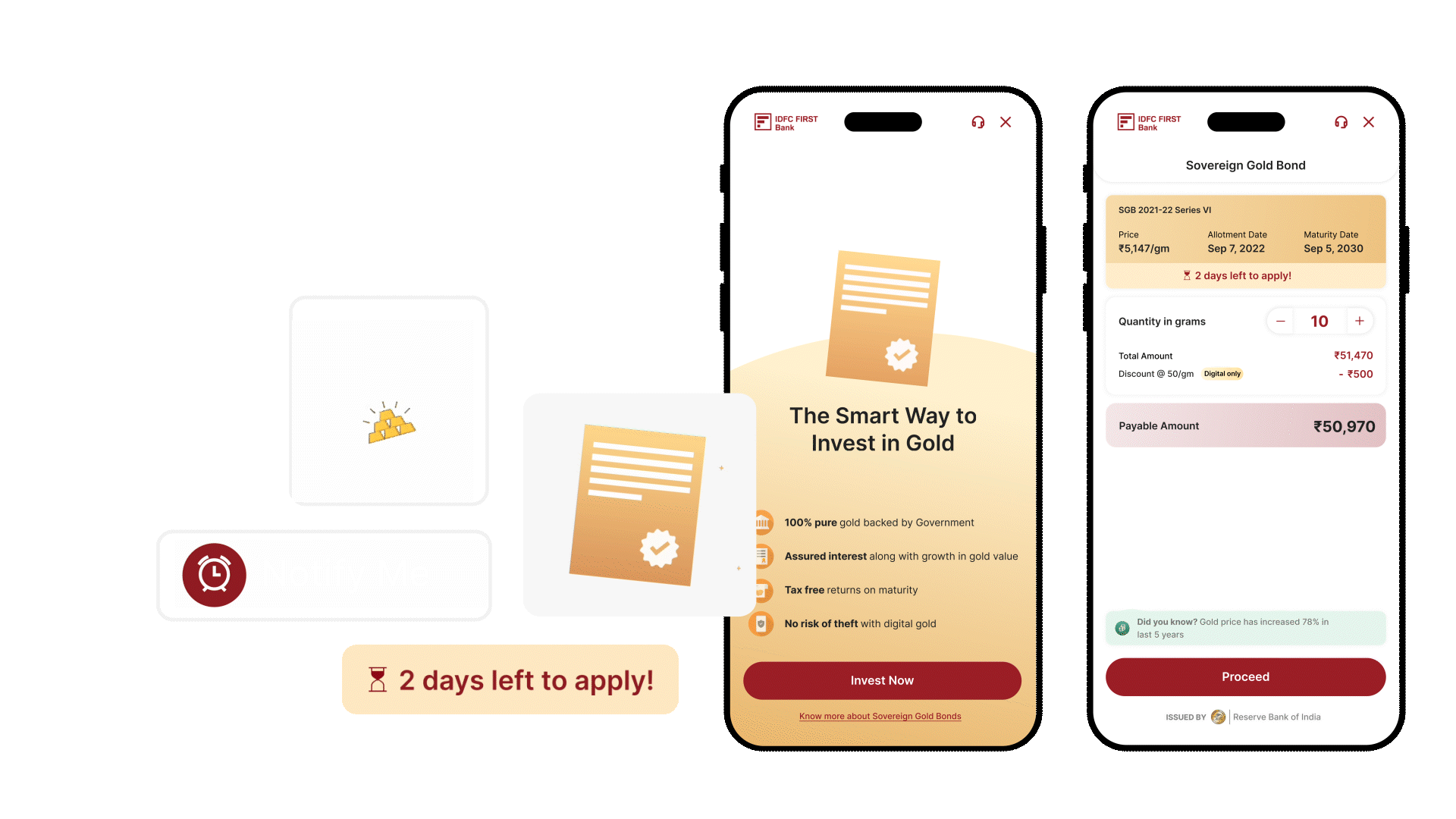
Leveraging micro-animations for a time sensitive journey like SGB
04 —
Prioritising guidance and personalization for journeys like Investments
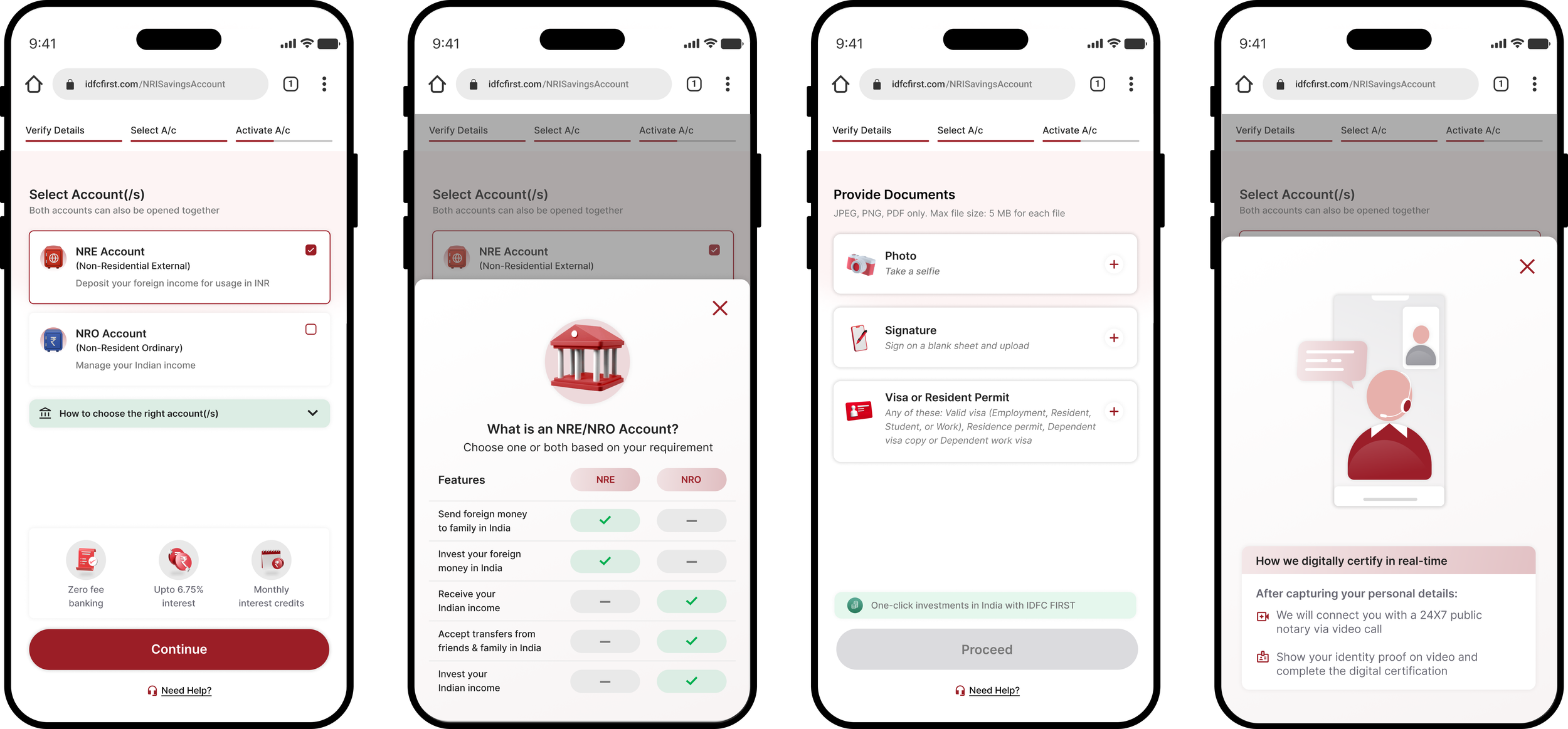
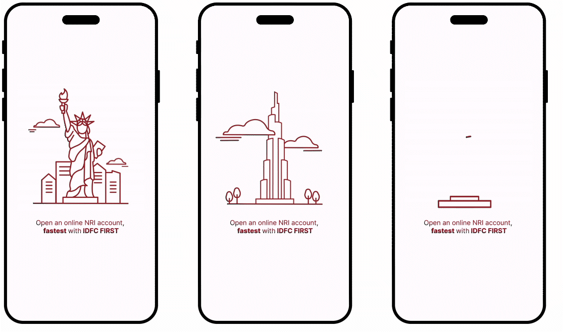
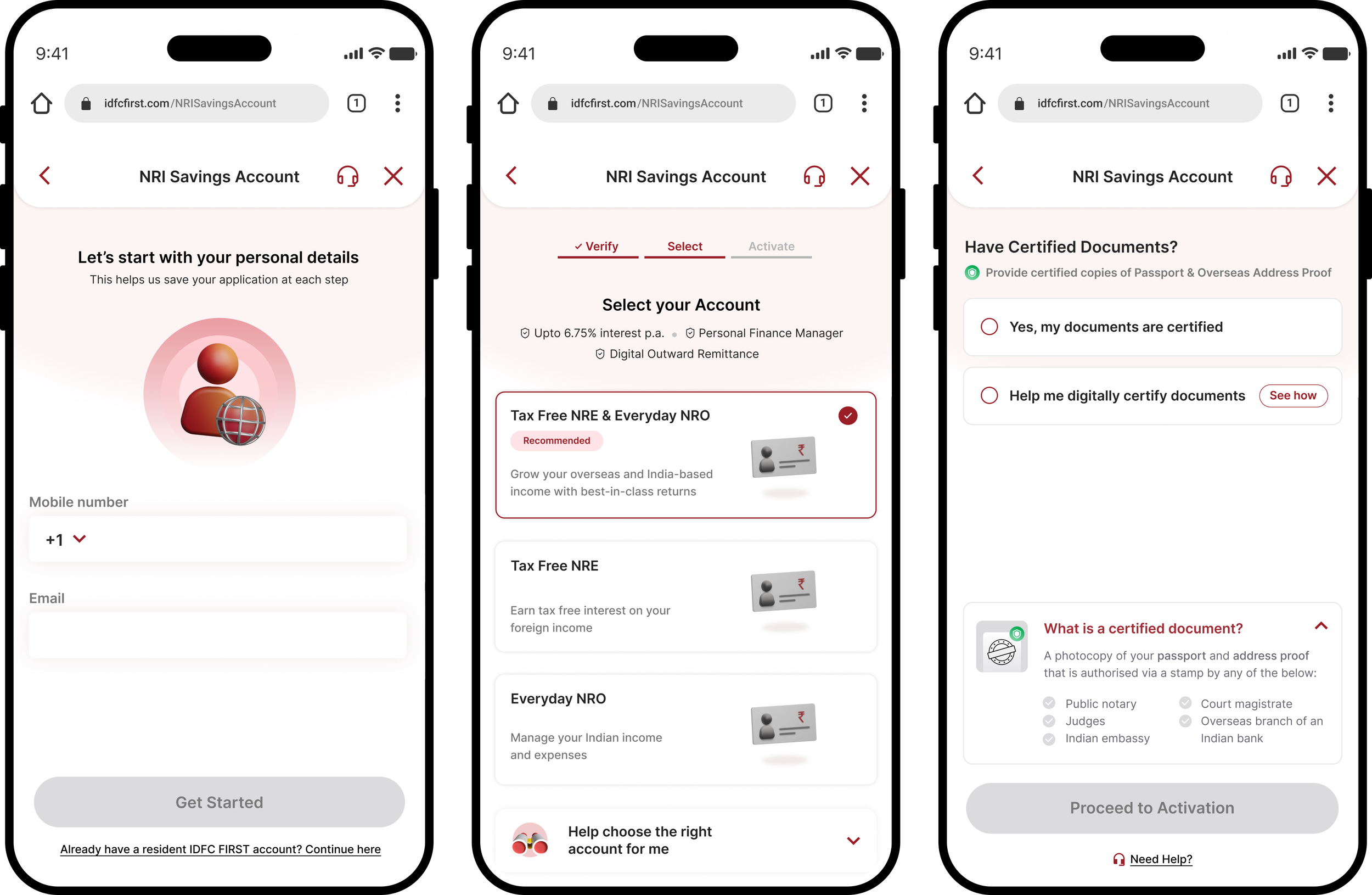
NRI Banking
Leveraging the power of care to provide a fully digital solution for NRI and their banking needs
As the internet continues to evolve beyond geographies, we leveraged the power of tech to create solutions to address people’s evolving needs. At IDFC bank, we prioritised care, to build a completely digital banking experience for NRIs sitting across the globe, managing their finances in India, ranging from creating a simple savings account to managing large investments from the comfort of their own homes.
As we moved on to developing the user flow, we prioritised three main pillars to guide our design process —

After talking to various users and gathering feedback we identified a new set of potential customers who were eager for simplistic and hassle-free banking. We aimed to transcend time zones, borders and eliminate back and forth between family members and banking personnel to conduct basic financial tasks.
We conducted UX vision and strategy workshops with multiple stakeholders including business heads as well as tech, engineering and design teams to establish a product vision, get a clear understanding of the existing product, its scope, opportunities, limitations and the reason this product would offer value to customers. We also benchmarked extensively by reviewing and understanding parallel products and captured their vision and insights as well
Identifying our users and their challenges
Long-term needs vs short-term needs
While we set out to build the NRI savings account journey, we realised that users had simple and hassle-free alternatives (apps like worldremit and zoom) to short-term financial needs such as transferring/receiving money, however, there was no fully digital solution for long term banking requirements like managing investments, properties and loans. We thus created a journey that would help users open a savings account based on their specific financial needs back home.
Notarization
The main challenge here was to develop a fully digital notary that saved users’ time and bank with IDFC from the comfort of their homes. We used the power of tech and AI to help users verify their international documents digitally.
Develop accessibility and reliability
We benchmarked various apps — Like SBI, ICICI, AXIS & HDFCto study their NRI services and realised that users didn't have an end-to-end digital solution that would guide them through the process as various steps required in person interventions making it less accessible to.
Conducting extensive user testing
Once we had a couple of iterations, we put together 3 cohorts to test out the journey. Live prototypes were handed to users and their interactions with it were recorded. Users were further probed about what worked for them, what didn't and what could be improved. We recorded user frustrations, potential dropoff points and opportunities for improvement.

Data Privacy
Apprehension/hesitation to perform certain tasks. Users are concerned about their sensitive credentials like SSNs, while others are concerned about the safety of using WhatsApp for banking. Whatsapp is for alerts not for financial decisions.
“What kind of information would I be sharing via WA - and is it safe? I don’t want my data to go anywhere else”
“I would trust it if it is encrypted”
“Whatsapp is for alerts not for financial decisions”
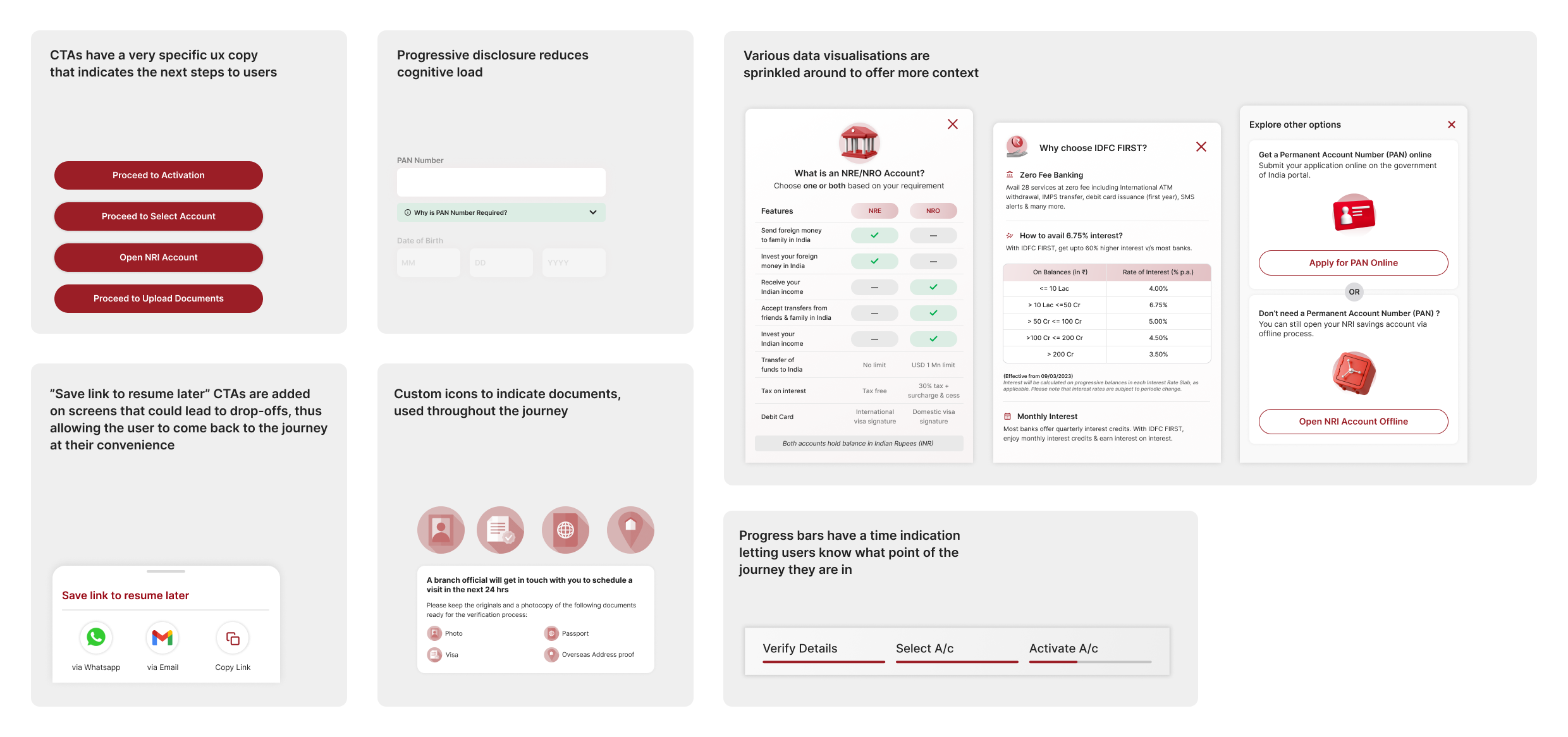
Transparency of steps
Users wanted more transparency as to why they need to perform certain tasks within the journey — why certain credentials are needed, what the next step in the user journey entails and how it can be preempted on the previous screens, and how digital notarization actually works.
“I need to know how long this will take i dont want to reach the upload documents stage and then scramble for documents”
“Need more clarity on the notorization process and how that will happen”
Value Propositions
The overall value propositions sprinkled throughout the journey could be more impactful, and reflect the USPs of the product more clearly — like comparison charts, different concepts and their comparisons listing down the pros and cons for each approach.
“These CRO hacks dont mean anything to me. Show me how this will impact me personally”
Finessing the visuals